This site is from a past semester! The current version will be here when the new semester starts.

Week 11 [Fri, Mar 29th] - Tutorial

1 Review the of a Peer Team

Do the following tP task.
  • To be done during the tutorial. Please don't do this task before the tutorial as others need time to update their DGs.
  • Read all instructions before you start the activity.
  • Find the team choices you have been allocated to review, as given in the panel below.

Allocation for DG review


  • Decide which of the given team(s) to review:

    • Open the DG link of the team allocated as 'First choice'.
    • Confirm that the DG has significant updates, to the diagrams in particular. If it doesn't, you can try the DG of the 'Second choice' team, and failing that, 'Third choice' team.
    • If neither one of the three has enough updates but collectively they have enough updates, you can also review all of them.
    • Failing all above, you can pick any other team(s) to review.
    • Try to give at least 4 comments in total.
    • If the PR already has reviews, you can give your own input of the existing review comments too.
  • Go to the PR of the team(s) you have chosen to review.

  • Review the Design and the Implementation sections w.r.t possible DG bugs (given further down); add your observations as comments.

  • In the PR, add review comments (i.e., in the files changed tab) in the corresponding place of the code.
    • In this case, choose the option rather than option.
  • But if the 'files changed' tab is too laggy, you can add a normal comment instead in the conversation tab.
    • In this case, enter each observation as a separate comment (reason: our bot will count the number of comments you have given to determine if you qualify for participation points)
  • As you know, it is better to phrase your comments as question/doubts (e.g., Is this format correct? Should it be ... instead?) rather than directives (e.g., Change this to ...).
    Where possible, use screenshots from their DG in your comments, preferably with annotations. This is particularly useful when commenting on diagrams. An example given below:
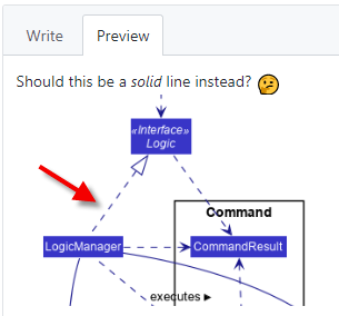
  • The understanding you gain from this exercise can indirectly determine how well you do in your own project. Note that your comments will be reviewed by a tutor later.
DG - Possible Bugs

Pay attention to these as they are same as the final evaluation criteria of the DG.

Admin tP Grading → DG Bugs → UML Diagrams → Possible Bugs

UML diagrams:

  • Notation incorrect or not compliant with the notation covered in the course.
  • Some other type of diagram used when a UML diagram would have worked just as well.
  • The diagram used is not suitable for the purpose it is used.
  • The diagram is too complicated.

Admin tP Grading → General Documentation Bugs

Use of visuals

  • Not enough visuals e.g., screenshots/diagrams
  • The visuals are not well integrated to the explanation
  • The visuals are unnecessarily repetitive e.g., same visual repeated with minor changes

Use of examples:

  • Not enough or too many examples e.g., sample inputs/outputs

Explanations:

  • The target user for the product and/or the value proposition is not specified clearly.
  • The explanation is too brief or unnecessarily long.
  • The information is hard to understand for the target audience. e.g., using terms the reader might not know

Neatness/correctness:

  • looks messy
  • not well-formatted
  • broken links, other inaccuracies, typos, etc.
  • hard to read/understand
  • unnecessary repetitions (i.e., hard to see what's similar and what's different)

Also see:

Admin tP: Deliverables → DG → Tips

  • Aim to showcase your documentation skills. The primary objective of the DG is to explain the design/implementation to a future developer, but a secondary objective is to serve as evidence of your ability to document deeply-technical content using prose, examples, diagrams, code snippets, etc. appropriately. To that end, you may also describe features that you plan to implement in the future, even beyond v2.1 (hypothetically).
    For an example, see the description of the undo/redo feature implementation in the AddressBook-Level3 developer guide.
  • Use multiple UML diagram types. Following from the point above, try to include UML diagrams of multiple types to showcase your ability to use different UML diagrams.
  • Diagramming tools:
    • AB3 uses PlantUML (see the guide Using PlantUML @SE-EDU/guides for more info).
    • You may use any other tool too (e.g., PowerPoint). But if you do, note the following:
      • Choose a diagramming tool that has some 'source' format that can be version-controlled using git and updated incrementally (reason: because diagrams need to evolve with the code that is already being version controlled using git). For example, if you use PowerPoint to draw diagrams, also commit the source PowerPoint files so that they can be reused when updating diagrams later.
      • Use the same diagramming tool for the whole project, except in cases for which there is a strong need to use a different tool due to a shortcoming in the primary diagramming tool. Do not use a mix of different tools simply based on personal preferences.
    • Can UML diagrams be used in project submissions? Not a good idea. Given below are three reasons each of which can be reported by evaluators as 'bugs' in your diagrams, costing you marks:
      • They often don't follow the standard UML notation (e.g., they add extra icons).
      • They tend to include every little detail whereas we want to limit UML diagrams to important details only, to improve readability.
      • Diagrams reverse-engineered by an IDE might not represent the actual design as some design concepts cannot be deterministically identified from the code e.g., differentiating between multiplicities 0..1 vs 1, composition vs aggregation.
  • Keep diagrams simple. The aim is to make diagrams comprehensible, not necessarily comprehensive.
    Ways to simplify diagrams:
    • Omit less important details. Examples:
      • a class diagram can omit minor utility classes, private/unimportant members; some less-important associations can be shown as attributes instead.
      • a sequence diagram can omit less important interactions, self-calls.
    • Omit repetitive details e.g., a class diagram can show only a few representative ones in place of many similar classes (note how the AB3 Logic class diagram shows concrete *Command classes using a placeholder XYZCommand).
    • Limit the scope of a diagram. Decide the purpose of the diagram (i.e., what does it help to explain?) and omit details not related to it.
    • Break diagrams into smaller fragments when possible.
      • If a component has a lot of classes, consider further dividing into sub-components (e.g., a Parser sub-component inside the Logic component). After that, sub-components can be shown as black-boxes in the main diagram and their details can be shown as separate diagrams.
      • You can use ref frames to break sequence diagrams to multiple diagrams.
    • Use visual representations as much as possible. E.g., show associations and navigabilities using lines and arrows connecting classes, rather than adding a variable in one of the classes.
    • For some more examples of what NOT to do, see here.
  • Integrate diagrams into the description. Place the diagram close to where it is being described.
  • Use code snippets sparingly. The more you use code snippets in the DG, and longer the code snippet, the higher the risk of it getting outdated quickly. Instead, use code snippets only when necessary and cite only the strictly relevant parts only. You can also use pseudo code instead of actual programming code.
  • Resize diagrams so that the text size in the diagram matches the the text size of the main text of the diagram. See example.

  • After the tutorial, if you are unsure about a concern raised by a reviewer, you can post in the forum to seek the opinion of the teaching team.